[React/리액트] ThemeProvider로 전역으로 디자인 시스템 설정하기
프론트엔드 프로젝트에서 styled-components와 TypeScript로 디자인 시스템 설정하기
프로젝트를 시작할 때 먼저 설정하면 편한 것들이 있다.
prettier, lint 설정이라던지 절대경로 설정이라던지... 그 중 하나인 디자인 시스템 설정을 해보자!
프론트로 개발을 할 때 피그마 보고 눈대중으로 값을 지정해서 개발을 하면 절대 안 된다 ㅎ
디자이너가 피그마에서 정해진 색상의 종류, 폰트의 종류를 고려하여 디자인 해야한다!
우리 프로젝트는 밑에 사진처럼 디자인 가이드가 나와있었다. 많이 쓰이는 색상이나 폰트, 크기, 행간을 설정해두고 디자인을 하는 경우거나 자주 사용하는 디자인이 있을 경우 이를 전역에 지정해두고 쓰는 것이 편하다!

이걸 지정해두지 않으면 모든 컴포넌트마다 font-size, font-weight, color 등을 일일히 피그마와 비교해서 찾고 설정하고 해야한다...
매우매우 번거롭고 슬픈 과정이기 때문에 이를 편하게 설정해두고 개발하고 싶어서! 미리 설정을 해두기로 했다.
styled-components에서 제공하는 ThemeProvider를 사용하여 전역으로 색상, 폰트 크기 등을 설정해보자.
1. theme.ts 생성하기
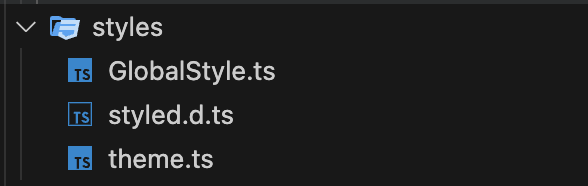
GlobalStyle.ts과 같이 스타일과 관련된 파일은 src/styles에 모아둔 상태이다.
여기에 theme.ts와 같이 많이 사용하는 스타일 등을 설정해두곤 한다.
theme.ts란?
프로젝트에서 자주 사용되거나 공통으로 사용되는 스타일(예: 색상, 폰트, 반응형 브레이크포인트 등)을 한 곳에 모아 관리하는 파일이다.
각 컴포넌트에서 반복적으로 사용되는 스타일을 일관되게 적용할 수 있으며, 일일이 색상과 폰트 크기 등을 설정하지 않아도 될 수 있도록 도와준다.
1-1. 색상 설정하기
프로젝트에서 사용할 색상 팔레트를 다음과 같이 설정한다.
export const colors = {
  orange: '#f87f01',
  yellow: '#fdd100',
  mintGreen: '#e7f0ed',
  navy: '#435969',
}
1-2. 폰트 설정하기
자주 사용하는 폰트와 크기 등의 스타일을 설정한다.
font-family에 사용하는 폰트는 index.css나 다른곳에서 선언을 미리 하고 사용해야 한다!
interface Font {
  font: string
  weight: number
  size: number
  lineHeight: number
}

const FONT = ({ font, weight, size, lineHeight }: Font): string => {
  return `
        font-family : "${font}";
        font-weight : ${weight};
        font-size : ${size}rem;
        line-height : ${lineHeight}%;
        `
}

export const fonts = {
  // 제목
  title1: FONT({
    font: 'SUITE-Regular',
    weight: 700,
    size: 2.4,
    lineHeight: 32,
  }),
  title2: FONT({
    font: 'SUITE-Regular',
    weight: 700,
    size: 2.0,
    lineHeight: 28,
  }),

  // 본문
  body1: FONT({
    font: 'SUITE-Regular',
    weight: 700,
    size: 2.0,
    lineHeight: 25,
  }),
  body2: FONT({
    font: 'SUITE-Regular',
    weight: 500,
    size: 1.5,
    lineHeight: 26,
  }),
  body3: FONT({
    font: 'SUITE-Regular',
    weight: 500,
    size: 1.4,
    lineHeight: 24,
  }),
  body4: FONT({
    font: 'SUITE-Regular',
    weight: 700,
    size: 1.3,
    lineHeight: 22,
  }),
  body5: FONT({
    font: 'SUITE-Regular',
    weight: 700,
    size: 1.2,
    lineHeight: 20,
  }),
  body6: FONT({
    font: 'SUITE-Regular',
    weight: 500,
    size: 1.1,
    lineHeight: 18,
  }),
}
1-3. theme이라는 하나의 객체로 export하기
ThemeProvider에서 사용할 수 있도록 theme 객체를 export해줬다.
import { DefaultTheme } from 'styled-components';


...


export type ColorsTypes = typeof colors
export type FontsTypes = typeof fonts

export const theme: DefaultTheme = {
  colors,
  fonts,
}
2. styled.d.ts 생성하기
TypeScript와 styled-components를 함께 사용할 때, 위에서 정의한 theme 객체의 타입을 확장하여 DefaultTheme 인터페이스에 포함시키기 위해서 객체의 구조를 정의해주는 과정이 필요하다. DefaultTheme에 theme 객체의 타입이 존재하지 않기 때문에 정의를 해줘야 함! 자바스크립트 환경에서는 만들 필요가 없다.
관련 문서 : https://dev.to/rajuashok/create-styled-d-ts-to-make-typescript-work-with-styled-components-5dk4
import 'styled-components'
import { ColorsTypes, FontsTypes } from './theme'

declare module 'styled-components' {
  export interface DefaultTheme {
    colors: ColorsTypes
    fonts: FontsTypes
  }
}
styled.d.ts를 만드는 첫 번째 방법
ColorsTypes와 FontsTypes를 개별적으로 정의하고 DefaultTheme 인터페이스에 포함시키는 방법이다.
import 'styled-components';
import { ColorsTypes, FontsTypes } from './theme';

declare module 'styled-components' {
  export interface DefaultTheme {
    colors: ColorsTypes;
    fonts: FontsTypes;
  }
}
이 방법은 colors와 fonts를 별도로 정의하고 사용하고자 할 때 유용하다!
styled.d.ts를 만드는 두 번째 방법
ThemeType을 사용하여 DefaultTheme 인터페이스를 확장하는 방법이다.
import 'styled-components';
import { ThemeType } from './theme';

declare module 'styled-components' {
  export interface DefaultTheme extends ThemeType {}
}
이 방법은 theme 객체 전체를 하나의 타입으로 정의하고, 이를 DefaultTheme에 확장하여 사용하고자 할 때 유용하다.
만들어진 파일과 전체 코드는 다음과 같다.
//theme.ts
import { DefaultTheme } from 'styled-components'

export const colors = {
  orange: '#f87f01',
  yellow: '#fdd100',
  lightYellow: '#FFEE9C',
  mintGreen: '#e7f0ed',
  navy: '#435969',
  gray1: '#767676',
  gray2: '#FFEE9C',
  idGray: '#9A9A9A',
  lightGray: '#E7E7E7',
  black: '#000000',
  white: '#FFFFFF',
}

interface Font {
  font: string
  weight: number
  size: number
  lineHeight: number
}

const FONT = ({ font, weight, size, lineHeight }: Font): string => {
  return `
        font-family : "${font}";
        font-weight : ${weight};
        font-size : ${size}px;
        line-height : ${lineHeight}%;
        `
}

export const fonts = {
  // 제목
  title1: FONT({
    font: 'SUITE-Regular',
    weight: 900,
    size: 24,
    lineHeight: 32,
  }),
  title2: FONT({
    font: 'SUITE-Regular',
    weight: 700,
    size: 20,
    lineHeight: 28,
  }),

  // 본문
  body1: FONT({
    font: 'SUITE-Regular',
    weight: 700,
    size: 20,
    lineHeight: 25,
  }),
  body2: FONT({
    font: 'SUITE-Regular',
    weight: 500,
    size: 15,
    lineHeight: 26,
  }),
  body3: FONT({
    font: 'SUITE-Regular',
    weight: 500,
    size: 14,
    lineHeight: 24,
  }),
  body4: FONT({
    font: 'SUITE-Regular',
    weight: 700,
    size: 13,
    lineHeight: 22,
  }),
  body5: FONT({
    font: 'SUITE-Regular',
    weight: 700,
    size: 12,
    lineHeight: 20,
  }),
  body6: FONT({
    font: 'SUITE-Regular',
    weight: 500,
    size: 11,
    lineHeight: 18,
  }),
}

export type ColorsTypes = typeof colors
export type FontsTypes = typeof fonts

export const theme: DefaultTheme = {
  colors,
  fonts,
}
//style.d.ts
import 'styled-components'
import { ColorsTypes, FontsTypes } from './theme'
declare module 'styled-components' {
export interface DefaultTheme {
colors: ColorsTypes
fonts: FontsTypes
}
}3. ThemeProvider로 theme.ts 사용하기
ThemeProvider를 사용하여 theme 객체를 전역에서 사용할 수 있도록 설정한다.
App.tsx(혹은 index.tsx)에서 다음과 같이 설정한다.
import './App.css'

import { ThemeProvider } from 'styled-components'
import GlobalStyle from './styles/GlobalStyle'
import { theme } from './styles/theme'

export default function App() {
  return (
    <>
      <ThemeProvider theme={theme}>
        <GlobalStyle />
      </ThemeProvider>
    </>
  )
}
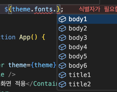
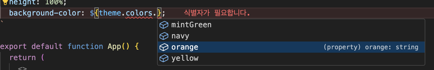
스타일 쓰는 방법은 ${theme.~~} 이런 식으로 써주면 된다! 사진 참고!
미리 설정해서 편하게 코딩하자
미설편코!!!
미설편코!!!